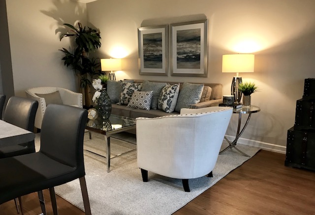
Artwork can be so overwhelming. What to buy? Where to buy?… And let’s not forget the dreaded, where do I put it? There are many stunning pieces out there at different price points that suit any budget and area of your home. If you follow our rules, anyone who walks into your home will definitely have something good to say!
RULE #1: SCALE
It’s all about scale, scale, scale. It really is quite simple; have a long sofa? Hang a long piece of art lengthwise above it. The mirrored effect can be quite effective at keeping the eye from becoming overwhelmed. If you choose to hang multiple art pieces or a collage above a couch, again keep things in perspective and balanced with the other elements of your room.
RULE #2: COLOUR
Choose art that coordinates with the rest of the room. If you have an accent colour, make sure your art has the same hue and can pull out your colour. You don’t have to get to crazy, matching art colour can be most effective when done in a subtle way.
RULE #3: PLACE
Where you put artwork plays a huge role in what a potential home buyer thinks of your house. Never hang art in cathedral ceilings or in an outrageously high spot on the wall. Doing this pulls the eye upwards and will actually intimidate the buyer because they think “how the hell am I supposed to hang something up there?”. Let the high ceilings and unique architectural features of your home speak for themselves.
RULE #4: TASTE
We know that everyone has a certain taste about art. Try not to fall into the trap of becoming too taste-specific. When selling your home, it’s best to appeal to the masses. If you are a Picasso fan or really love funky abstract pieces, unfortunately, not everyone does. Try soft floral prints or nature themed, they tend to receive a more positive response versus confusion.
RULE #5: OPTIONS
When it comes to artwork, you’ve got options. If the canvas isn’t doing it for you, hanging a large mirror or even multiple mirrors instead will do the trick. Iron artwork is also very popular right now, it adds a different dimension and richness to any room. And lastly, something we see all the time; staggered art (hanging two pieces side-by-side but one lower than the other). Basically, it highlights your inability to properly hang artwork and looks lazy so just don’t do it!

